Sprout Social
Social Media Management Platform
Research / UX / DesignSprout Social is a complex, multi-featured social media management platform that serves everyone from small, three person dental practices to enterprise brands like Lemonade, WIZ, and Calendly.
In order to meet the needs of our customers and keep abreast of the rapidly evolving social media landscape, I delivered a number of projects meant to empower our customers to proactively manage communications with their own unique customer base.
Trial Onboarding
Trial conversions as being problematic, specifically people were finding it difficult to understand the make up of Sprout’s message objects, how to engage with and organize them. The Messaging product itself was empty upon first use and trial users were left clueless on how to proceed and populate their inbox with their numerous social media accounts.
I designed a messaging onboarding experience that could pre-empt a new user, as was the case with Messaging, or be accessed if a particular feature had enough content for the user to explore. The information was organized according to findings while researching and interviewing customers.

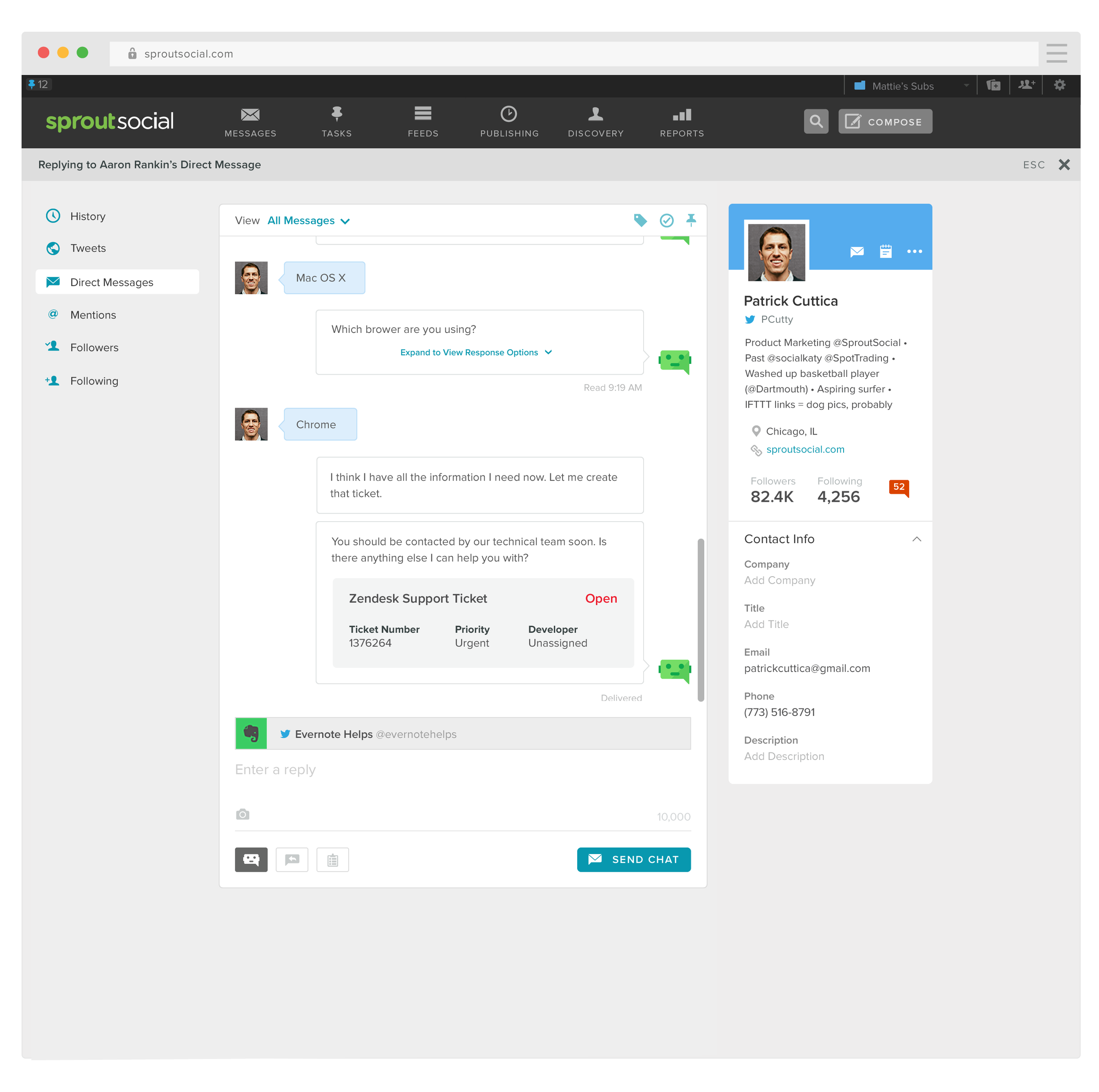
Automated Chat
Anticipating the prevalence of AI customer service agents, Sprout Social added automated chat bots to their customer’s messaging capabilities. This was especially valuable for customer support social channels as it could be integrated with their ticketing systems. Sprout’s users would be notified if an issue was resolved, or notified if the chat bot had reached its limit and needed them to step in. They would be presented with the conversation highlights and ticket that had been generated and allowed to get up to speed quickly.
Conversations were archived and searchable, allowing our users to refer to previous conversations if additional context was needed.